Propensity score matching is a non-experimental causal inference technique. It attempts to balance the treatment groups on confounding factors to make them comparable so that we can draw conclusions about the causal impact of a treatment on the outcome using observational data.
This is important when AB testing is not feasible or simply not an option. In this article, we’ll learn the basics behind propensity score matching.
WHAT IS PROPENSITY SCORE MATCHING?
Propensity score matching is a non-experimental causal inference technique that attempts to balance the treatment groups on confounding factors to make them comparable. This allows users to draw conclusions about the causal impact of a treatment on the outcome using observational data.
Experimental Data vs. Observational Data
In this section, we will briefly cover the two types of data that are relevant in analyzing causality. Before we start, let’s get aligned on three key terms:
- Outcome variable: A variable of interest for which we want to understand treatment’s effect on. This is the effect.
- Treatment variable: A variable of interest for which we want to understand its impact on the outcome variable. This is the cause.
- Confounding variable: A variable that influences both the selection of treatment and the outcome variables. In some contexts, this is also referred to as a covariate.

MORE ON DATA SCIENCE:What Is Bootstrapping Statistics?
EXPERIMENTAL DATA
Experimental data is data collected as part of an AB test, such as a randomized experiment, controlled study or randomized control trials, among other variants. In an AB test, treatments are randomly assigned to the individuals and not selected by them. This means there is no selection bias and the treatment assignment is independent from any confounders.

In an AB test, a random representative large enough sample of the population is collected. Participants in the AB test are then randomly assigned to different treatment groups: A and B. This random assignment helps splitting the participants into similar groups where the confounding factors are balanced. When we introduce treatment to one group but not to the other, the key difference between the groups is the treatment. Since the groups are comparable in the absence of the treatment, we can reasonably say that statistically significant difference in the outcome between the groups is caused by the treatment.
OBSERVATIONAL DATA
Any data that is not collected as part of an AB test is observational data. In observational data, treatments are selected by the individuals and not randomly assigned to them. This means there is selection bias, and treatment is no longer independent from the confounding factors.
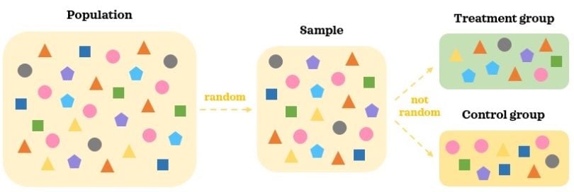
In observational data, we collect a random representative sample of the population. As treatments are selected by individuals, there are likely to be differences in confounding factors between the groups. Hence, the two groups are not comparable to start with even in the absence of the treatment. It’s hard to say that statistically significant difference in the outcome between the groups is caused by the treatment when there are other moving pieces at play.
Having refreshed the types of data, it’s time to learn the basics of making causal inference from observational data with propensity score matching.
Propensity Score Matching
There are five key steps when doing causal analysis with propensity score matching.
5 STEPS TO PROPENSITY SCORE MATCHING
- Collect data.
- Estimate propensity scores.
- Match records.
- Evaluate matching.
- Evaluate treatment effect on the outcome.
Let’s familiarize ourselves with each of these steps and apply them to an example.
STEP 1: COLLECT DATA
This is the most important step of the causal analysis. The aim of this step is to collect data on all possible confounders based on the domain expertise. If important confounders are left out from the data, we will risk a false conclusion about the causal impact of the treatment on the outcome. The data collection step plays a key role in reliability and effectiveness of the causal inference.
When working with temporal data (i.e. data that varies over time), the temporal confounders should show their state prior to the treatment and the temporal outcome should be captured post-treatment. For instance, sales revenue in online shopping is a temporal variable. If we decide to use it as a confounder, it should capture sales revenue amount before the treatment happens.
As our example, we will use the widely accessible Titanic data. We will keep the number of confounders minimal to keep things manageable and easy to understand. Here’s our hypothesized relationship structure:

We will try to understand the impact of getting a third class cabin on survival rate. Let’s load the necessary libraries and the data:
import numpy as np
import pandas as pd
pd.options.display.float_format = "{:.2f}".format
import matplotlib.pyplot as plt
import seaborn as sns
sns.set(style='darkgrid', context='talk')
from sklearn.preprocessing import StandardScaler
from sklearn.linear_model import LogisticRegression
from sklearn.pipeline import Pipeline
from sklearn.metrics import roc_auc_score, f1_score
from causalinference import CausalModel
df = sns.load_dataset('titanic')
df['is_pclass3'] = df['pclass']==3
df['is_female'] = df['sex']=='female'
df = df.filter(['survived', 'is_pclass3', 'is_female', 'age'])\
       .dropna().reset_index(drop=True)
df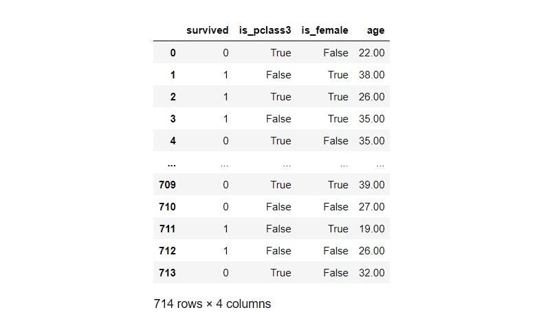
TREATMENT = 'is_pclass3'
OUTCOME = 'survived'
df.groupby(TREATMENT)[OUTCOME].describe()
Third class passengers’ (treatment group) survival rate is 24 percent, whereas passengers from other classes (control group) have a survival rate of 57 percent. Let’s now inspect the distribution of the confounders by the treatment groups:
C_COLOUR = 'grey'
T_COLOUR = 'green'
C_LABEL = 'Control'
T_LABEL = 'Treatment'
sns.kdeplot(data=df[~df[TREATMENT]], x='age', shade=True,
            color=C_COLOUR, label=C_LABEL)
sns.kdeplot(data=df[df[TREATMENT]], x='age', shade=True,
            color=T_COLOUR, label=T_LABEL)
plt.legend();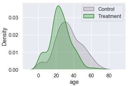
The treatment group has more younger passengers compared to the control. Let’s check the distribution of gender:
F_COLOUR = 'magenta'
M_COLOUR = 'blue'
F_LABEL = 'Female'
M_LABEL = 'Male'
gender = 100 * pd.crosstab(df[TREATMENT].replace({True: T_LABEL,
                                                  False: C_LABEL}),
                           df['is_female'].replace({True: 'Female',
                                                    False: 'Male'}),
                           normalize='index')
gender['All'] = 100
plt.figure(figsize=(5, 4))
sns.barplot(data=gender, x=gender.index.astype(str),  y="All",
            color=M_COLOUR, label=M_LABEL)
sns.barplot(data=gender, x=gender.index.astype(str),  y='Female',
            color=F_COLOUR, label=F_LABEL)
plt.legend(loc='center', bbox_to_anchor=(1.3, 0.8))
plt.xlabel('')
plt.ylabel('Percentage');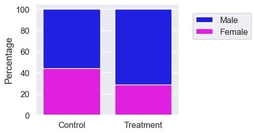
The treatment group also has more males. Since the confounding factors are not balanced between the two groups, it’s naïve to say that the difference in survival rate is due to the treatment at this stage. Now, let’s learn how to make the groups more comparable.
STEP 2: ESTIMATE PROPENSITY SCORES
Once we have collected the data, we can build the propensity model predicting the probability of receiving the treatment given the confounders. Typically, logistic regression is used for this classification model. Let’s build a propensity model:
# Build a descriptive model
t = df[TREATMENT]
X = pd.get_dummies(df.drop(columns=[OUTCOME, TREATMENT]))
pipe = Pipeline([
    ('scaler', StandardScaler()),
    ('logistic_classifier', LogisticRegression())
])
pipe.fit(X, t)
# Predict
threshold = 0.5
df['proba'] = pipe.predict_proba(X)[:,1]
df['logit'] = df['proba'].apply(lambda p: np.log(p/(1-p)))
df['pred'] = np.where(df['proba']>=threshold, 1, 0)
df.head()
We didn’t partition the data into a train and test split because we aren’t building a predictive model. Propensity score tells us the probability of an individual getting the treatment given the confounders. We have also prepared the logit transformation of the propensity score. Let’s assess the model:
print(f"Accuracy: {np.mean(df[TREATMENT]==df['pred']):.4f},\
 ROC AUC: {roc_auc_score(df[TREATMENT], df['proba']):.4f},\
 F1-score: {f1_score(df[TREATMENT], df['pred']):.4f}")
# Visualise confusion matrix
pd.crosstab(df[TREATMENT], df['pred']).rename(columns={0: False,
                                                       1:True})
We will inspect the distribution of the propensity score and its logit transformation by the treatment groups:
fig, ax = plt.subplots(1,2, figsize=(10,4))
# Visualise propensity
sns.kdeplot(data=df[~df[TREATMENT]], x='proba', shade=True,
            color=C_COLOUR, label=C_LABEL, ax=ax[0])
sns.kdeplot(data=df[df[TREATMENT]], x='proba', shade=True,
            color=T_COLOUR, label=T_LABEL, ax=ax[0])
ax[0].set_title('Propensity')
ax[0].legend(loc='center', bbox_to_anchor=(1.1, -0.3))
# Visualise logit propensity
sns.kdeplot(data=df[~df[TREATMENT]], x='logit', shade=True,
            color=C_COLOUR, label=C_LABEL, ax=ax[1])
sns.kdeplot(data=df[df[TREATMENT]], x='logit', shade=True,
            color=T_COLOUR, label=T_LABEL, ax=ax[1])
ax[1].set_title('Logit Propensity')
ax[1].set_ylabel("");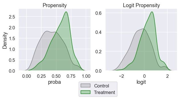
We can see that both groups have some overlap in their propensity scores across the range. This is good when it comes to matching.
STEP 3: MATCH RECORDS
We are going to match the most similar control records to the passengers in the treatment group. Finding similar records in one dimension (propensity score) is much easier than doing so in many dimensions (confounders). This may remind you of dimensionality reduction methods. Propensity score is a balancing score. This means, if we match records based on the propensity score, the distribution of the confounders between matched records will likely be similar.
In the following script, we find a control record with the most similar propensity score for each example in the treatment group (one-to-one matching). When doing so, we will sample the control records with replacement. This means some control records can be matched multiple times to different treatment records, whereas some control records are not matched at all:
# Sort by 'logit' so it's quicker to find match
df.sort_values('logit', inplace=True)
n = len(df)-1
for i, (ind, row) in enumerate(df.iterrows()):
    # Match the most similar untreated record to each treated record
    if row[TREATMENT]:
        # Find the closest untreated match among records sorted
        # higher. 'equal_or_above would' be more accurate but
        # used 'above' for brevity
        if i<n:
            above = df.iloc[i:]
            control_above = above[~above[TREATMENT]]
            match_above = control_above.iloc[0]
            distance_above = match_above['logit'] - row['logit']
            df.loc[ind, 'match'] = match_above.name
            df.loc[ind, 'distance'] = distance_above

        # Find the closest untreated match among records sorted
        # lower. 'equal_or_below' would be more accurate but
        # used 'below' for brevity
        if i>0:
            below = df.iloc[:i-1]
            control_below = below[~below[TREATMENT]]
            match_below = control_below.iloc[-1]
            distance_below = match_below['logit'] - row['logit']
            if i==n:
                df.loc[ind, 'match'] = match_below.name
                df.loc[ind, 'distance'] = distance_below

            # Only overwrite if match_below is closer than match_above
            elif distance_below<distance_above:
                df.loc[ind, 'match'] = match_below.name
                df.loc[ind, 'distance'] = distance_below
df[df[TREATMENT]]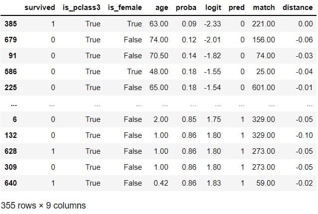
Matching is done. While we have done one of the simplest versions of matching in this example, it’s good to note that there are more sophisticated matching techniques that we could utilize. We will now create a new data set called matched_df that contains the original treatment group and a new control group:
indices = df[df['match'].notna()].index.\
          append(pd.Index(df.loc[df['match'].notna(), 'match']))
matched_df = df.loc[indices].reset_index(drop=True)
matched_df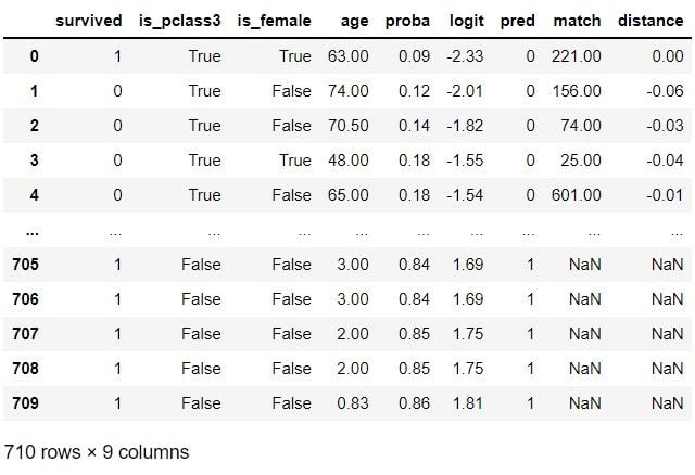
This new control group should be more similar to the treatment group according to the confounding factors. Let’s find out if that’s the case in the next section.
STEP 4: EVALUATE THE QUALITY OF THE MATCHED RECORDS
It’s time to evaluate how good the matching was. Let’s inspect if the groups look more comparable in terms of the confounders:
COLUMNS = ['age', 'is_female', OUTCOME]
matches = pd.merge(df.loc[df[TREATMENT], COLUMNS+['match']],
                   df[COLUMNS], left_on='match',
                   right_index=True,
                   how='left', suffixes=('_t', '_c'))
matches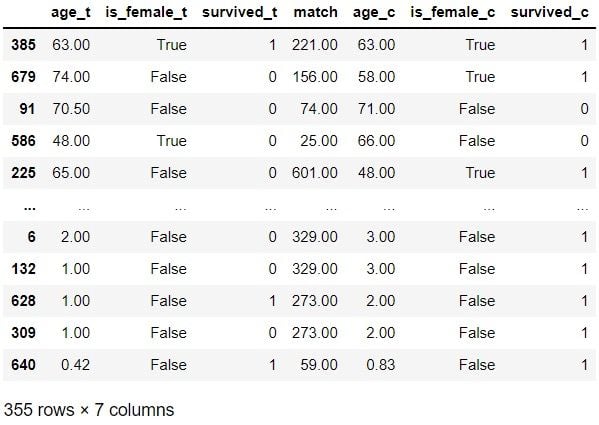
Of these 10 examples, treatment records 679, 586 and 225 don’t seem very similar to their control matches. However, the matches look quite similar for the remaining seven examples. Let’s now check the distribution:
for var in ['logit', 'age']:
    print(f"{var} | Before matching")
    display(df.groupby(TREATMENT)[var].describe())
    print(f"{var} | After matching")
    display(matched_df.groupby(TREATMENT)[var].describe())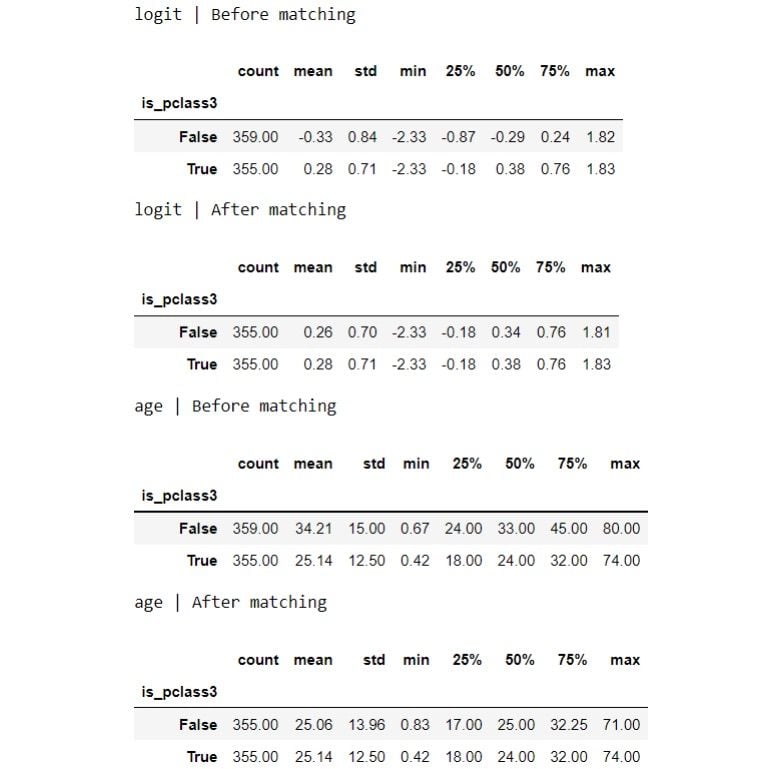
The distribution looks more similar between the groups now after the matching. Let’s visualize the distributions:
for var in ['logit', 'age']:
    fig, ax = plt.subplots(1,2,figsize=(10,4))
    # Visualise original distribution
    sns.kdeplot(data=df[~df[TREATMENT]], x=var, shade=True,
                color=C_COLOUR, label=C_LABEL, ax=ax[0])
    sns.kdeplot(data=df[df[TREATMENT]], x=var, shade=True,
                color=T_COLOUR, label=T_LABEL, ax=ax[0])
    ax[0].set_title('Before matching')

    # Visualise new distribution
    sns.kdeplot(data=matched_df[~matched_df[TREATMENT]], x=var,
                shade=True, color=C_COLOUR, label=C_LABEL, ax=ax[1])
    sns.kdeplot(data=matched_df[matched_df[TREATMENT]], x=var,
                shade=True, color=T_COLOUR, label=T_LABEL, ax=ax[1])
    ax[1].set_title('After matching')
    ax[1].set_ylabel("")
    plt.tight_layout()
ax[0].legend(loc='center', bbox_to_anchor=(1.1, -0.3));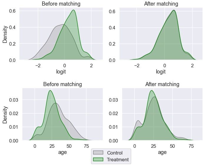
Age looks more balanced between the groups than before. Let’s inspect the distribution of gender:
print(f"{'is_female'} | Before matching")
display(pd.crosstab(df[TREATMENT], df['is_female'],
                    normalize='index'))
print(f"{'is_female'} | After matching")
display(pd.crosstab(matched_df[TREATMENT], matched_df['is_female'],
            normalize='index'))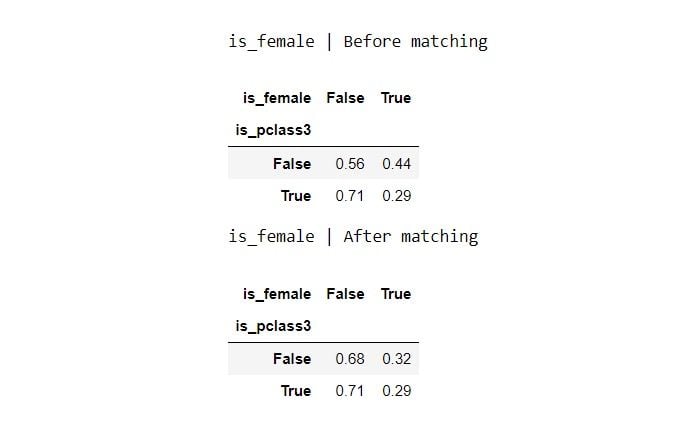
The gender ratio is more similar between the groups.
fig, ax = plt.subplots(1, 2, figsize=(10, 4))
# Visualise original distribution
sns.barplot(data=gender, x=gender.index.astype(str), y="All",
            color=M_COLOUR, label=M_LABEL, ax=ax[0])
sns.barplot(data=gender, x=gender.index.astype(str), y='Female',
            color=F_COLOUR, label=F_LABEL, ax=ax[0])
ax[0].legend(loc='center', bbox_to_anchor=(1.1, -0.3))
ax[0].set_xlabel('')
ax[0].set_ylabel('Percentage')
ax[0].set_title('Before matching')
# Visualise new distribution
gender_after = 100 * pd.crosstab(
    matched_df[TREATMENT].replace({True: T_LABEL, False: C_LABEL}),
    matched_df['is_female'].replace({True: 'Female', False: 'Male'}),
    normalize='index'
)
gender_after['All'] = 100
sns.barplot(data=gender_after, x=gender_after.index.astype(str),
            y="All", color=M_COLOUR, label=M_LABEL, ax=ax[1])
sns.barplot(data=gender_after, x=gender_after.index.astype(str),
            y='Female', color=F_COLOUR, label=F_LABEL, ax=ax[1])
ax[1].set_xlabel('')
ax[1].set_title('After matching')
ax[1].set_ylabel('');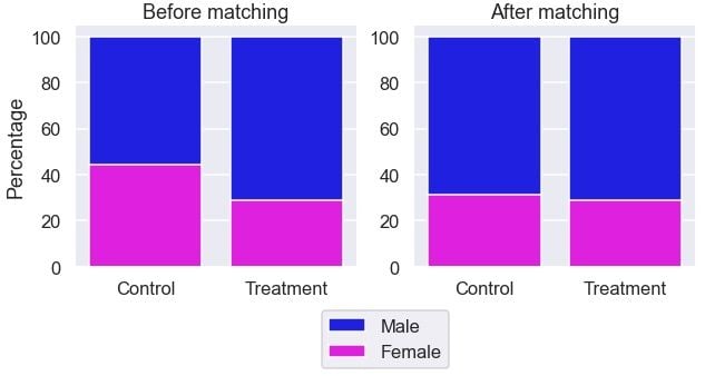
It looks the gender ratio is more comparable between the two groups after the matching.
If we aren’t happy with the matching, we can go back to the previous steps and tweak them until we are satisfied with the matches. Once we are happy with the matching and believe the confounding factors are balanced between the groups, we can move on to the next step of understanding the causal impact of the treatment.
STEP 5: EVALUATE TREATMENT EFFECT ON THE OUTCOME
Now, it’s time to familiarize ourselves with a few terms related to the treatment effect, also known as the causal effect. Looking at a small example with a continuous outcome may be the easiest way to get familiarized with it:
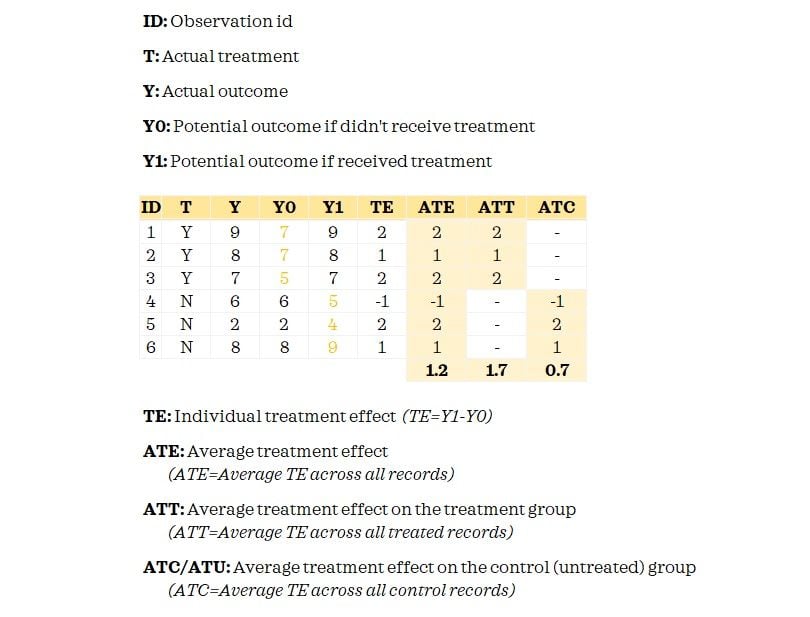
The fundamental problem of causal inference is that we don’t observe both potential outcomes. We only know the Y0 for the control group and have Y1 for the treatment group. When we matched records, we attempted to proxy Y0 for the treated records so that we could measure the treatment effect.
Now having understood these key terms, you may have already guessed that we are going to estimate the ATT. This is because we did matching only for the treated records. If we did full matching, we can estimate the ATE.
Here’s the descriptive statistics on the outcome between the treatment and new control groups:
summary = matched_df.groupby(TREATMENT)[OUTCOME]\
                    .aggregate(['mean', 'std', 'count'])
summary
Let’s estimate the average treatment effect on the treated:
c_outcome = summary.loc[False, 'mean']
t_outcome =  summary.loc[True, 'mean']
att = t_outcome - c_outcome
print('The Average Treatment Effect on Treated (ATT): {:.4f}'\
      .format(att))
We can also use the following approach to get the ATT:
att = np.mean(matches['survived_t']-matches['survived_c'])
print('The Average Treatment Effect on Treated (ATT): {:.4f}'\
      .format(att))
Assuming we have accounted for all the confounding factors in our analysis, we can infer that getting a third-class passenger cabin causes the chance of survival to drop by approximately 22 percent among those who got the third-class passenger cabin. While we looked at the point estimate in this simplified example, a much better approach would be to look at an interval estimate.
We have explored a simplistic manual example to understand the intuition behind propensity score matching. In practice, it’s often wiser and more practical to use dedicated libraries such as causalinference, DoWhy or MatchIt in R. For instance, using causalinference library, we can estimate the treatment effects like this:
y = df[OUTCOME].values
t = df[TREATMENT].values
X = df[['is_female', 'age']]
X = pd.DataFrame(StandardScaler().fit_transform(X),
                 columns=X.columns).values
model = CausalModel(y, t, X)
model.est_via_matching()
print(model.estimates)
We can see that the estimated “ATT” is similar to our result but now we have a confidence interval in this output. In addition, we also get “ATE” and “ATC.”
Causal inference techniques can enable us to answer difficult yet important questions about casual relationships.


