Today i teach you about Data Visualization with Python Altair Library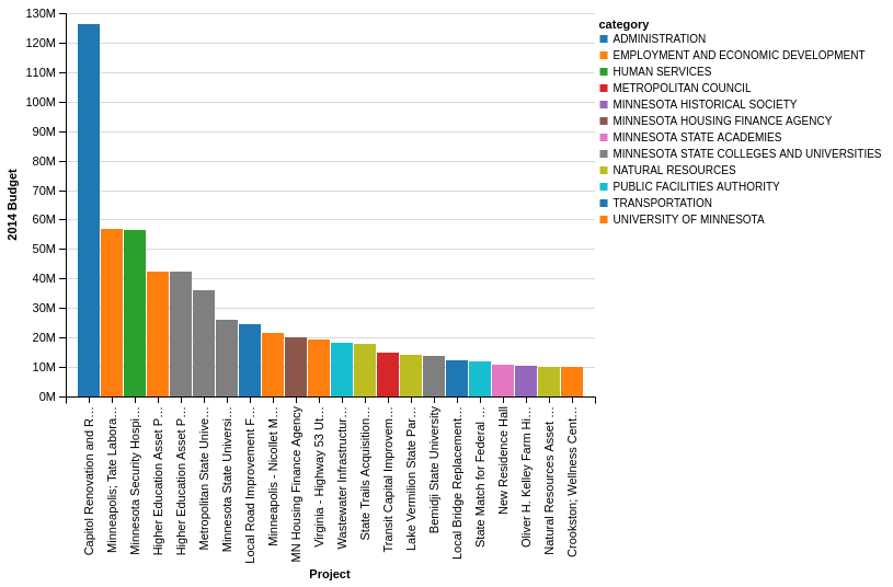 Background
One of the unique design philosophies of Altair is that it leverages the Vega-Lite specification to create “beautiful and effective visualizations with minimal amount of code.” What does this mean? The Altair site explains it well:
Altair provides a Python API for building statistical visualizations in a declarative manner. By statistical visualization we mean:
- The data source is a DataFrame that consists of columns of different data types (quantitative, ordinal, nominal and date/time).
- The DataFrame is in a tidy format where the rows correspond to samples and the columns correspond the observed variables.
- The data is mapped to the visual properties (position, color, size, shape, faceting, etc.) using the group-by operation of Pandas and SQL.
- The Altair API contains no actual visualization rendering code but instead emits JSON data structures following the Vega-Lite specification. For convenience, Altair can optionally use ipyvega to display client-side renderings seamlessly in the Jupyter notebook.
Where Altair differentiates itself from some of the other tools is that it attempts to interpret the data passed to it and make some reasonable assumptions about how to display it. By making reasonable assumptions, the user can spend more time exploring the data than trying to figure out a complex API for displaying it.
To illustrated this point, here is one very small example of where Altair differs from matplotlib when charting values. In Altair, if I plot a value like 10,000,000, it will display it as 10M whereas default matplotlib plots it in scientific notation (1.0 X 1e8). Obviously it is possible to change the value but trying to figure that out takes away from interpreting the data. You will see more of this behavior in the examples below.
The Altair documentation is an excellent series of notebooks and I encourage folks interested in learning more to check it out. Before going any further, I wanted to highlight one other unique aspect of Altair related to the data format it expects. As described above, Altair expects all of the data to be in tidy format. The general idea is that you wrangle your data into the appropriate format, then use the Altair API to perform various grouping or other data summary techniques for your specific situation. For new users, this may take some time getting used to. However, I think in the long-run it is a good skill to have and the investment in the data wrangling (if needed) will pay off in the end by enforcing a consistent process for visualizing data. If you would like to learn more, I found this article to be a good primer for using pandas to get data into the tidy format.
Getting Started
Altair works best when run in a Jupyter notebook. For this article, I will use the MN Budget data I have used in the past. The main benefits of this approach are that you can see a direct comparison between the various solutions I built in the past and the data is already in a tidy format so no additional manipulation is needed.
Based on the installation instructions, I installed Altair using conda:
conda install altair --channel conda-forge
I fired up the notebook and got my imports in place and read in the data:
import pandas as pd
from altair import Chart, X, Y, Axis, SortField

budget = pd.read_csv("https://github.com/chris1610/pbpython/raw/master/data/mn-budget-detail-2014.csv")
budget.head()
| category | detail | amount | |
|---|---|---|---|
| 0 | UNIVERSITY OF MINNESOTA | Higher Education Asset Preservation (HEAPR) 1 | 42500000 |
| 1 | UNIVERSITY OF MINNESOTA | Minneapolis; Tate Laboratory Renovation | 56700000 |
| 2 | UNIVERSITY OF MINNESOTA | Crookston; Wellness Center | 10000000 |
| 3 | UNIVERSITY OF MINNESOTA | Research Laboratories | 8667000 |
| 4 | UNIVERSITY OF MINNESOTA | Duluth; Chemical Sciences and Advanced Materia… | 1500000 |
Let’s do a simple pandas bar plot of the top 10 values in descending order:
budget_top_10 = budget.sort_values(by='amount',ascending=False)[:10]
budget_top_10.plot(kind="bar", x=budget_top_10["detail"],
                   title="MN Capital Budget - 2014",
                   legend=False)
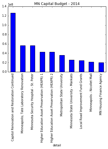
This is a functional but not beautiful plot. I will use this as the basis for creating a more robust and visually appealing version using Altair.
Getting Started Charting with Altair
The simplest way to chart this data is using Altair’s Chart object in a Jupyter notebook:
Chart(budget_top_10).mark_bar().encode(x='detail', y='amount')
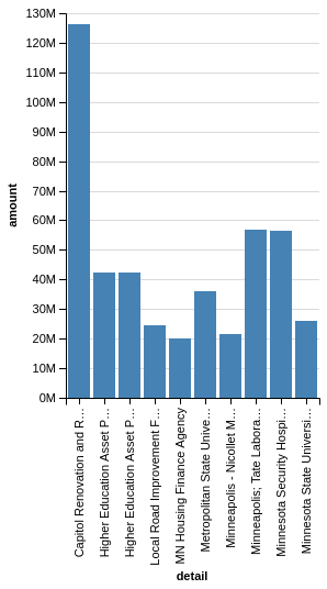
The basic steps to create an Altair chart are:
- create a
Chartobject with a pandas DataFrame (in tidy format) - choose the appropriate marking (
mark_barin this example) encodethe x and y values with the appropriate columns in the DataFrame
Let’s say that you would like to convert this to a horizontal bar chart. All you need to do is to swap the x and y values:
Chart(budget_top_10).mark_bar().encode(y='detail', x='amount')
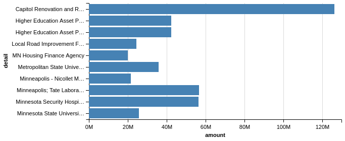
I think you will agree that these are visually appealing charts and the process for creating them is fairly straightforward. As I mentioned above, Altair made some choices for us related to the labeling of the Amounts as well as truncating the labels. Hopeful you can start to see how Altair works and makes it easy to create appealing graphs.
More Control Over The Charts
The basic encoding approach shown above is greate for simple charts but as you try to provide more control over your visualizations, you will likely need to use the X , Y and Axis classes for your plots.
For instance, the following code will present the same plot as our first bar chart:
Chart(budget_top_10).mark_bar().encode(x=X('detail'), y=Y('amount'))
The use of the X and Y will allow us to fine tune the future iterations of this plot.
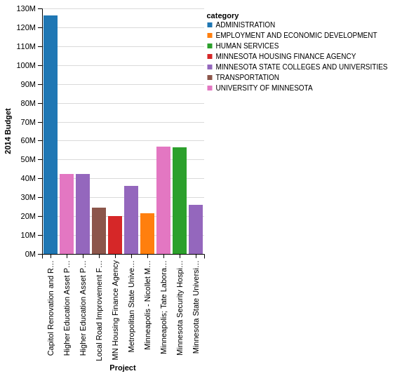
In order to add some more information to our plot, let’s use a different color to denote each category of spending:
Chart(budget_top_10).mark_bar().encode(
    x=X('detail'),
    y=Y('amount'),
    color='category')

This is a simple way to add some more info to our bar chart. It would also be nice to add more labels to the X & Y axis. We do this by bringing in the Axis class.
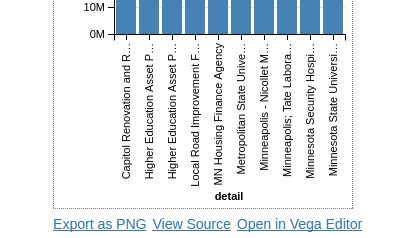
Chart(budget_top_10).mark_bar().encode(
    x=X('detail:O',
        axis=Axis(title='Project')),
    y=Y('amount:Q',
        axis=Axis(title='2014 Budget')),
    color='category')
You probably noticed that I added the :O and :Q text to the X and Y axes. The Vega-Lite specification needs to know what type of data it is plotting. Altair can make reasonable inferences but it is probably best to specify so that you get the behavior you expect. Here is a chart that shows the available options:
| Data Type | Code | Description |
|---|---|---|
| quantitative | Q | Number |
| nominal | N | Unordered Categorical |
| ordinal | O | Ordered Categorical |
| temporal | T | Date/Time |
Transforming the Data
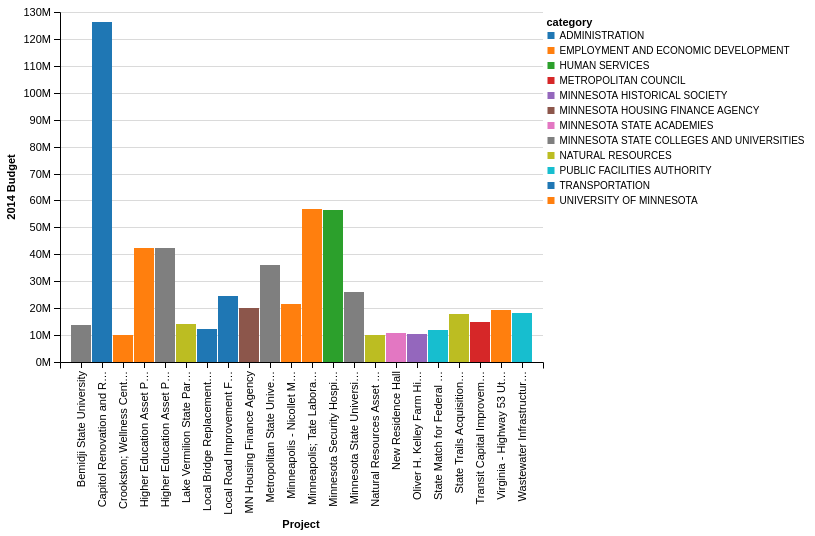
The steps above show all the basic steps required to chart your data. Astute readers noticed that the sorting of the DataFrame does not hold over to the Altair chart. Additionally, I cheated a little bit at the very beginning of this article by sub-selecting only the top 10 expenditures. The Vega-Lite spec provides a way to perform several types of manipulations on the data. I chose the top 10 as a somewhat arbitrary number to make the chart simpler. In real-life, you would probably define a numeric cutoff. Let’s do that by using transform_data on the original budget DataFrame, not the budget_top_10 . I will filter by the amount column for all values >= $10M.
Chart(budget).mark_bar().encode(
    x=X('detail:O',
        axis=Axis(title='Project')),
    y=Y('amount:Q',
        axis=Axis(title='2014 Budget')),
    color='category').transform_data(
      filter='datum.amount >= 10000000',
        )
One final item is that the data for project spend is not sorted from highest to lowest. We can also do that using the SortField . The interesting thing about sorting in this manner is that you can tell Altair to sort the “detail” column based on the sum of the values in the “amount” column. It took me a little bit to figure this out so hopefully this example is helpful.
Chart(budget).mark_bar().encode(
    x=X('detail:O', sort=SortField(field='amount', order='descending', op='sum'),
        axis=Axis(title='Project')),
    y=Y('amount:Q',
        axis=Axis(title='2014 Budget')),
    color='category').transform_data(
      filter='datum.amount >= 10000000',
        )
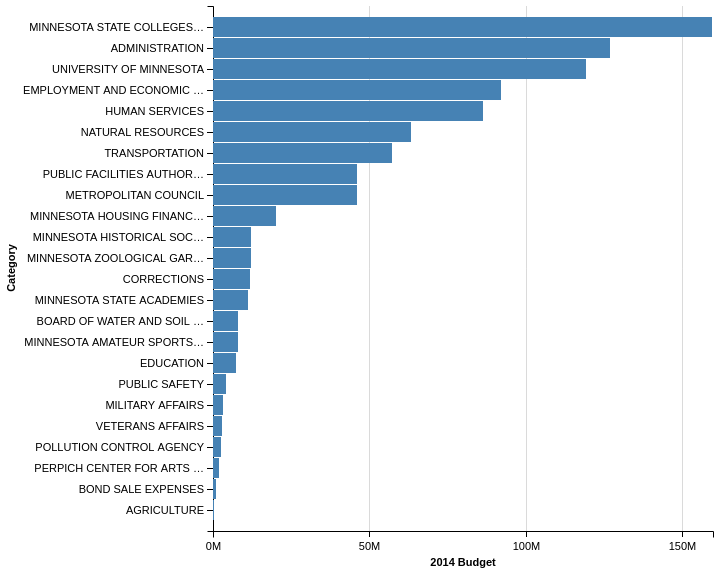
The advantage of this filtering approach is that it is trivial to develop a plot that shows the total spend by category and display in a horizontal chart. For this case, I can tell it to sum the “amount” column without doing any manipulations in pandas:
c = Chart(budget).mark_bar().encode(
    y=Y('category', sort=SortField(field='amount', order='descending', op='sum'),
        axis=Axis(title='Category')),
    x=X('sum(amount)',
        axis=Axis(title='2014 Budget')))
c
JSON
Up until now, I have not spent any time talking about the underlying approach Altair uses to convert the python code to a Vega-Lite graphic. Altair is essentially converting the python code into a JSON object that can be rendered as PNG. If we look at the last example, you can see the actually underlying JSON that is rendered:
c.to_dict(data=False)
{'encoding': {'x': {'aggregate': 'sum',
   'axis': {'title': '2014 Budget'},
   'field': 'amount',
   'type': 'quantitative'},
  'y': {'axis': {'title': 'Category'},
   'field': 'category',
   'sort': {'field': 'amount', 'op': 'sum', 'order': 'descending'},
   'type': 'nominal'}},
 'mark': 'bar'}
This architecture allows for some pretty cool functionality. One example is that you can choose to export your display as a PNG or open it in an online Vega Editor: