Here i share an article of Data Visualizations with Altair in Python
Being able to create easily understandable yet sophisticated plots is vital to becoming a successful data scientist. Creating visualizations is a great way to tell the underlying story in your data. It highlights the relationships within the data and reveals information visible to the human eye that cannot be conveyed with just numbers and digits. But you know what is even better than visualizations for data analysis? Interactive visualizations!
Unfortunately, as a novice, it can seem like a daunting task. Python and R both provide a vast range of tools and tricks to assist you with the task. In this tutorial, we will introduce you to Altair. With Altair, you will be able to create meaningful, elegant, and effective visualizations with just a few lines of code and in a very short time. So let’s get started!
- What is Altair?
- Yet another visualization library? Think NOT! You shall learn about Imperative VS Declarative APIs in this section.
- Then after, we shall install Altair and load the Movies dataset
- You will then be introduced to some fundamental concepts in Altair like charts, marks, and encodings to make some cool visualizations.
What is Altair?
Altair is a Python library designed for statistical visualization. It is declarative in nature (we shall come to this definition later on). It is based on Vega and Vega-Lite, which are both visualization grammar that allows you to describe the visual appearance and interactive behavior of a visualization in a JSON format.
Imperative vs. Declarative APIs
As mentioned earlier, Python already has a list of great tools and libraries at your disposal for the task of data visualization, and many even support interactive visualization. But what makes Altair stand out?
The answer lies in its declarative nature as compared to the other imperative APIs.
With imperative APIs, you need to focus your attention on ‘how to do something’ rather than ‘what you want to do’. You will have to think more about the code required to create the visualization, and manually specify the plotting steps – axis limits, size, rotation, legends, etc.
As a data scientist, Altair will allow you to focus your time, and effort more on your data – understanding, analyzing and visualizing it rather than on the code needed to do so. This means you can define the data and the output you expect to see (what the visualization should look like in the end), and Altair will do the necessary manipulations automatically for you.
Installation
In this tutorial, we will make use of an example datasets from Vega datasets. To install Altier, along with the Vega datasets, type the following in your console window:
$ pip install altair vega_datasets
If you are using the conda package manager, the equivalent is:
$ conda install -c conda-forge altair vega_datasets
After this, you can move on to your Jupyter Notebook and import Altair to get started. To learn more about Jupyter notebook, be sure to check out the Jupyter Notebook Definitive guide from DataCamp.
Data
Now that we have installed Altair along with the Vega dataset, it’s time to load some data. Start with the following imports:
import pandas as pd
import altair as alt
Why import Pandas?
Because data in Altair is built around the Pandas Dataframe, it means that you can manipulate data in Altair the same way you would deal with Pandas DataFrame.
And although internally Altair stores data in the format of a Pandas DataFrame, there are multiple ways of inputting data:
- as a Pandas DataFrame
- as a Data or related object (i.e. UrlData, InlineData, NamedData)
- as a URL string pointing to a JSON or CSV formatted text file
- as an object that supports the geo_interface (e.g., Geopandas GeoDataFrame, Shapely Geometries, GeoJSON Objects)
Movies Dataset
In this tutorial, we will be working with the Movies Dataset from the Vega dataset. This or similar dataset related to movies are famous in the data science community, especially in the context of Recommendation Engines. However, we will only perform data analysis on it using visualizations with Altair.
The dataset contains information related to movies such as the title of the movie, how much money did the movie gross in America and worldwide, along with the production budget, genre, ratings from IMDB and Rotten Tomatoes. We will not deal with all the columns but instead only use a few to learn more about the functioning of Altair as a visualization tool.
Let’s move ahead and get the dataset and perform some simple analysis to understand it better.
# Importing the Vega Dataset
from vega_datasets import data as vega_data

movies_df = pd.read_json(vega_data.movies.url)

# Checking the type of data that we get
print("movies_df is of the type: ", type(movies_df))

print("movies_df: ", movies_df.shape)
movies_df is of the type:  <class 'pandas.core.frame.DataFrame'>
movies_df:  (3201, 16)
As you saw, the movies_df is actually a pandas DataFrame and has 3201 movies (row) with 16 feature information (columns) each. Let’s check out the data within the dataframe.
movies_df.head(5)
| Title | US_Gross | Worldwide_Gross | US_DVD_Sales | Production_Budget | Release_Date | MPAA_Rating | Running_Time_min | Distributor | Source | Major_Genre | Creative_Type | Director | Rotten_Tomatoes_Rating | IMDB_Rating | IMDB_Votes | |
|---|---|---|---|---|---|---|---|---|---|---|---|---|---|---|---|---|
| 0 | The Land Girls | 146083.0 | 146083.0 | NaN | 8000000.0 | Jun 12 1998 | R | NaN | Gramercy | None | None | None | None | NaN | 6.1 | 1071.0 |
| 1 | First Love, Last Rites | 10876.0 | 10876.0 | NaN | 300000.0 | Aug 07 1998 | R | NaN | Strand | None | Drama | None | None | NaN | 6.9 | 207.0 |
| 2 | I Married a Strange Person | 203134.0 | 203134.0 | NaN | 250000.0 | Aug 28 1998 | None | NaN | Lionsgate | None | Comedy | None | None | NaN | 6.8 | 865.0 |
| 3 | Let’s Talk About Sex | 373615.0 | 373615.0 | NaN | 300000.0 | Sep 11 1998 | None | NaN | Fine Line | None | Comedy | None | None | 13.0 | NaN | NaN |
| 4 | Slam | 1009819.0 | 1087521.0 | NaN | 1000000.0 | Oct 09 1998 | R | NaN | Trimark | Original Screenplay | Drama | Contemporary Fiction | None | 62.0 | 3.4 | 165.0 |
The column values are:
movies_df.columns
Index(['Title', 'US_Gross', 'Worldwide_Gross', 'US_DVD_Sales',
       'Production_Budget', 'Release_Date', 'MPAA_Rating', 'Running_Time_min',
       'Distributor', 'Source', 'Major_Genre', 'Creative_Type', 'Director',
       'Rotten_Tomatoes_Rating', 'IMDB_Rating', 'IMDB_Votes'],
      dtype='object')
We will now use the to_datetime function within pandas to covert the column Release_Date into a real date and then extract the ‘year’ value from it. Later we will be using this newly created column in our visualizations.
def extract_year(value):
    return pd.to_datetime(value, format='%b %d %Y').year

movies_df["Year"] = movies_df["Release_Date"].apply(extract_year)
If now you check the column values, you will see a new column called Year that contains the year values for the corresponding movie.
movies_df.columns
Index(['Title', 'US_Gross', 'Worldwide_Gross', 'US_DVD_Sales',
       'Production_Budget', 'Release_Date', 'MPAA_Rating', 'Running_Time_min',
       'Distributor', 'Source', 'Major_Genre', 'Creative_Type', 'Director',
       'Rotten_Tomatoes_Rating', 'IMDB_Rating', 'IMDB_Votes', 'Year'],
      dtype='object')
Now, we will move on to create some plot. But before we do that, run this piece of code:
alt.renderers.enable('notebook')
RendererRegistry.enable('notebook')
What the code above does is that it allows Altair to render inline in the Jupyter notebook, so we are able to see the figures we develop. In case you run into more problems, check out Altair’s troubleshooting page.
A first look at the data, it would be interesting to see the relationship between how much money went to the making of the movie (Production_Budget) and how much money the movie actually made (Worldwide_Gross). We shall plot these values in the X and Y axis.
However, the dataset is relatively large – given that our focus is to play with Altair. So, for the time being, we shall work with only a few data points. Let’s check out the number of movies in a given year in our dataset and pick a year we would like to focus on.
movies_df["Year"].value_counts()
2006    220
2005    210
2002    208
2004    192
2000    188
       ...
1943      1
2015      1
2027      1
2037      1
1928      1
Name: Year, Length: 91, dtype: int64
Let’s put our focus on the year 2000 and make a new dataframe movies_2000 containing data only from this year. It should contain 188 rows (movies).
movies_2000 = movies_df[movies_df["Year"] == 2000]
movies_2000.shape
(188, 17)
We shall now work towards our first visualization. Let’s dive a little deeper into Altair’s format to do so.
Charts
Charts are a fundamental object in Altair, and it accepts a single argument – a dataframe. The way we define a chart is as follows:
alt.Chart(DataFrame)
But on its own, the chart won’t do much except specify the data you want to work with then after you need to provide what you want to do next with the data. This is where we use marks.
Marks
The mark property lets you specify how the data needs to be represented on the plot. Following are the basic mark properties provided by Altair: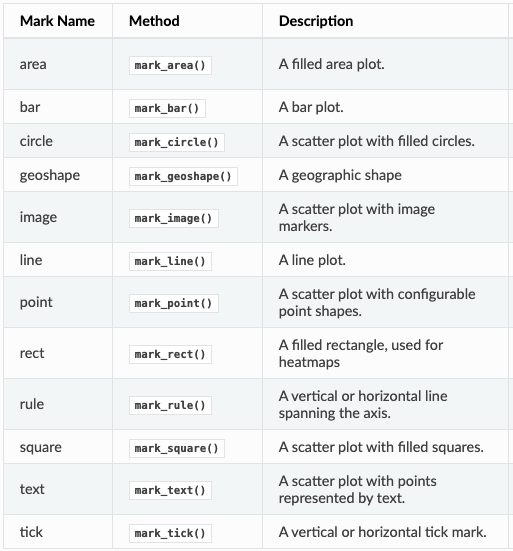
For the mark property, we would like each value in the dataFrame to be marked as a point(circle) in the plot. Hence, we will write:
alt.Chart(DataFrame).mark_point()
Encodings
Once we have the data and how it is represented – we want to specify where to represent it. That is, set up the positions, size, color, etc. This is where we use encodings. Hence, we have:
alt.Chart(DataFrame).mark_point().encode()
Putting, all this together and adding details to make our first visualization:
alt.Chart(movies_2000).mark_point().encode(
    alt.X('Production_Budget'),
    alt.Y('Worldwide_Gross')
)
<vega.vegalite.VegaLite at 0x11709a1d0>

Isn’t that great? We didn’t have to do much – we got familiar with some terminology and put it all together. Now, we have a plot where we see the amount spent vs. the amount grossed by the movies in the year 2000 that we had in our dataset.
Let’s make this graph more interesting. Rather than the points all being marked with the same circle size, let’s try to make the pointers as big (or small) as their corresponding US_Gross. For this, we introduce the Size feature. So, the bigger the circle pointer size, the bigger is their US box-office earnings. Let’s also color the circle pointers and not just outline them; for this, we shall add an argument to the mark_point() property.
alt.Chart(movies_2000).mark_point(filled=True).encode(
    alt.X('Production_Budget'),
    alt.Y('Worldwide_Gross'),
    alt.Size('US_Gross')
)
<vega.vegalite.VegaLite at 0x117cce790>

Now, we have a plot depicting the budgets of each movie in a mere four lines. What’s missing? COLOR!
But we are not just going to add a random color for the sake of it! We are going to keep the graph interesting by introducing one more information we have on the dataset, Major_Genre. We will give each genre of the movie its own color by using the Color feature and add some transparency to the color with OpacityValue.
alt.Chart(movies_2000).mark_point(filled=True).encode(
    alt.X('Production_Budget'),
    alt.Y('Worldwide_Gross'),
    alt.Size('US_Gross'),
    alt.Color('Major_Genre'),
    alt.OpacityValue(0.7)
)
<vega.vegalite.VegaLite at 0x118e3ff50>

Need Help with Researchers or Data Analysts, Lets Help you with Data Analysis & Result Interpretation for your Project, Thesis or Dissertation?
We are Experts in SPSS, EVIEWS, AMOS, STATA, R, and Python
This is already good, but not good enough! It would be great if we could move around the plot and also see details about the movie that the data point represents. Tooltip lets us do just that…
alt.Chart(movies_2000).mark_point(filled=True).encode(
    alt.X('Production_Budget'),
    alt.Y('Worldwide_Gross'),
    alt.Size('US_Gross'),
    alt.Color('Major_Genre'),
    alt.OpacityValue(0.7),
    tooltip = [alt.Tooltip('Title'),
               alt.Tooltip('Production_Budget'),
               alt.Tooltip('Worldwide_Gross'),
               alt.Tooltip('US_Gross')
              ]
)
<vega.vegalite.VegaLite at 0x118e3ff90>
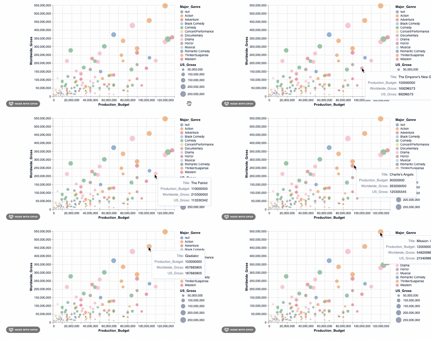
Isn’t that cool? But hold on, let’s do more. Remember why we wanted to use Altair in the first place? It was so we can make interactive visualizations. The tooltip already introduces some interaction when you hover around the datapoints. However, let’s add a simple interactive() functionality to what we have already…
alt.Chart(movies_2000).mark_point(filled=True).encode(
    alt.X('Production_Budget'),
    alt.Y('Worldwide_Gross'),
    alt.Size('US_Gross'),
    alt.Color('Major_Genre'),
    alt.OpacityValue(0.7),
    tooltip = [alt.Tooltip('Title'),
               alt.Tooltip('Production_Budget'),
               alt.Tooltip('Worldwide_Gross'),
               alt.Tooltip('US_Gross')
              ]
).interactive()
<vega.vegalite.VegaLite at 0x118e3c750>

Adding that simple piece of code already lets you zoom into a particular area – fixing the axis values automatically so you can focus on the specific area of interest. But there are many more advanced interactive features that you can add to your graph. We can check one of these out…
We finally have a cool plot to showcase our data. Let’s bring in all the data points and put them in our graph. But wait, don’t you think it’ll be too much to put all data points in a single visualization. Also, we definitely want to separate them on the basis of the Year value we created earlier. To do so, we will use an advanced selection property.
select_year = alt.selection_single(
    name='Select', fields=['Year'], init={'Year': 1928},
    bind=alt.binding_range(min=1928, max=2046, step=10)
)

alt.Chart(movies_df).mark_point(filled=True).encode(
    alt.X('Production_Budget'),
    alt.Y('Worldwide_Gross'),
    alt.Size('US_Gross'),
    alt.Color('Major_Genre'),
    alt.OpacityValue(0.7),
    tooltip = [alt.Tooltip('Title:N'),
               alt.Tooltip('Production_Budget:Q'),
               alt.Tooltip('Worldwide_Gross:Q'),
               alt.Tooltip('US_Gross:Q')
              ]
).add_selection(select_year).transform_filter(select_year)
<vega.vegalite.VegaLite at 0x117cd4cd0>

So, we use the add_selection property to introduce the select_year as a single selection feature to the plot and then, after, apply the transform_filter() to actually apply the transformation to the plot.
Did you notice another new addition to the code? The ‘Q’ and ‘N’ placed in the Tooltip. This is to specify the data type: N-Nominal (categorical data), Q-Quantitative (numerical data), O-Ordinal (ordered data), or T-Temporal (time points or intervals).
Check out the oldest and the latest year in the dataset.
print("The oldest year is: ", movies_df["Year"].min())
print("The latest year is: ", movies_df["Year"].max())
The oldest year is:  1928
The latest year is:  2046
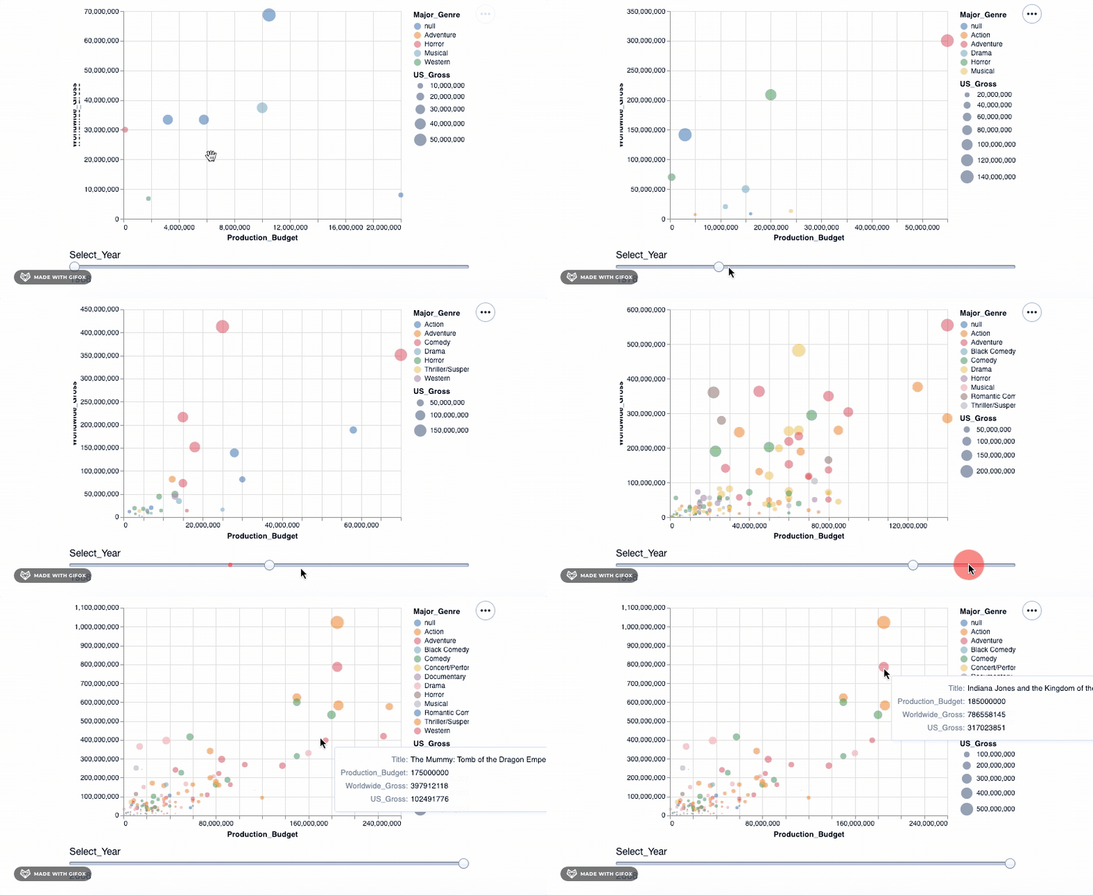
As you can see, when you drag the bar ‘Select_Year’, there are not many movies represented in the year 1928 – 1967. And there aren’t any movie data recorded after 2018 and certainly not till 2046. We can use the binding_range() property to specify the range in the years and also the year step sizes.
In a real-life project, such findings are important and can point towards errors in your data gathering stage or somewhere during the process. You would need to deal with errors effectively. This is an important step during data preprocessing. Check out Data Preparation with pandas for an introduction to these vital steps.
Let’s adjust the years, and with this, we have our final visualization ready…
select_year = alt.selection_single(
    name='Select', fields=['Year'], init={'Year': 1968},
    bind=alt.binding_range(min=1968, max=2008, step=10)
)

alt.Chart(movies_df).mark_point(filled=True).encode(
    alt.X('Production_Budget'),
    alt.Y('Worldwide_Gross'),
    alt.Size('US_Gross'),
    alt.Color('Major_Genre'),
    alt.OpacityValue(0.7),
    tooltip = [alt.Tooltip('Title:N'),
               alt.Tooltip('Production_Budget:Q'),
               alt.Tooltip('Worldwide_Gross:Q'),
               alt.Tooltip('US_Gross:Q')
              ]
).add_selection(select_year).transform_filter(select_year)
<vega.vegalite.VegaLite at 0x1180cda10>
In this tutorial, you were introduced to Altair. You saw how, with a few lines of code, you can create beautiful, interactive plots that help you tell the story in your data more effectively. This tutorial hopes to showcase the power and potential of Altair. To learn more about Altair, go to their official website.
